New Lightning Components
Note: – The following components are new and require API version 42.0 and later.
- lightning:carousel (Beta): – A collection of images that are displayed horizontally one at a time. As this is a beta version feature it will have some limitations.

- lightning:formattedAddress: – Displays a formatted address that provides a link to the given location on Google Maps.

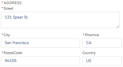
- lightning:inputAddress: – Input fields represents an address compound field with support for street, city, province, postal code, and country.
- lightning:inputField : – An editable field with a label, help text, and value that corresponds to a field on a Salesforce object. This component must be nested in a lightning:recordEditForm component.
- lightning:inputName: – Represents a name compound field with support for salutation, first name, middle name, last name, informal name, and suffix.

- lightning:listView : – Represents a list view of records that you own or have read or write access to, and records shared with you.

- lightning:recordEditForm : – A record edit or record create layout that displays one or more fields provided by lightning:inputField.

- lightningsnapin:prechatAPI : – Enables customization of the user interface for the pre-chat page in Snap-ins Chat.
Changed Lightning Components
lightning:datatable: – Datatable an amazing feature that we got in the previous release (winter 18) has many new features in the coming release Spring 18.
Text wrapping and clipping within a column is now supported. Text wrapping expands the height of the rows to reveal more content. Content is clipped by default if the number of characters is more than what the column width can hold. To toggle between the two views, select Wrap text or Clip text from the dropdown menu on the column header.Other features that are now supported include:
- Appending icons to the header column
- Header-level actions
- Infinite loading of rows
- Row-level actions
- Selecting rows programmatically
- Using a button as a data type
These features are captured by the following lists of attributes, column properties, and data types.
The following attributes are new.
- enableInfiniteLoading—Enables or disables infinite loading. The default is false.
- isLoading—Specifies whether more data is being loaded, and displays a spinner if there is. The default is false.
- loadMoreOffset—Determines when to trigger infinite loading based on how many pixels the table’s scroll position is from the bottom of the table. The default is 20.
- selectedRows—Enables programmatic row selection with a list of keyField values.
- maxRowSelection—Maximum number of rows that can be selected. Checkboxes are used for selection by default, and radio buttons are used when maxRowSelection is 1.
- onheaderaction—The action triggered when a header action is clicked. By default, it also closes the header actions menu.
- onloadmore—The action triggered when infinite loading loads more data.
- onresize—The action triggered when the table renders columns each time it resizes a column.
- onrowaction—The action triggered when a row action is clicked. By default, it also closes the row actions menu.
- rowNumberOffset—Determines where to start counting the row number. The default is 0.
- showRowNumberColumn—Shows or hides the row number column. Set to true to show the row number column. The default is false.
The following column properties are new.
- actions—Appends a dropdown menu of actions to a column.
- cellAttributes—Provides additional customization, such as appending an icon to the output. You can pass in these attributes: iconName, iconLabel, iconPosition.
- iconName—The Lightning Design System name of the icon. Names are written in the format standard:opportunity. The icon is appended to the left of the header label.
The following data types are now supported.
- action—Displays a dropdown menu using lightning:buttonMenu with actions as menu items. This data type supports these typeAttributes properties: rowActions and menuAlignment.
- button—Displays a button using lightning:button. This data type supports these typeAttributes properties: disabled, iconName, iconPosition, label, name, title, variant.
The url data type now supports the following typeAttributes property.
- label—The text to display in the link. Give label of the record name or anything you want.
The date type now supports the following typeAttributes properties.
- day—Valid values are numeric and 2-digit.
- era—Valid values are narrow, short, and long.
- hour—Valid values are numeric and 2-digit.
- hour12—Determines whether the time is displayed as 12-hour. If false, time displays as 24-hour. The default setting is determined by the user’s locale.
- minute—Valid values are numeric and 2-digit.
- month—Valid values are 2-digit, narrow, short, and long.
- second—Valid values are numeric and 2-digit.
- timeZone—The time zone to use. Implementations can include any time zone listed in the IANA time zone database. The default is the runtime’s default time zone. Use this attribute only if you want to override the default time zone.
- timeZoneName—Valid values are short and long. For example, the Pacific time zone displays as PST if you use short or Pacific Standard Time if you use long.
- weekday—Valid values are narrow, short, and long.
- year—Valid values are numeric and 2-digit.
Happy Reading 🙂
You can try all these features into the Sandbox Org once this release has been loaded into Sandbox after 5th Jan OR 6th of Jan 2018.
Resources: –
 SFDC Panther
Hi Amit Singh.
Great post On “top-10-features-for-lightning-development-spring-18-release”.
we also have a Salesforce blog in which we write all about salesforce And we aslo wrote a blog On Tools and Services Useful for the Lightning Developers. Please refer to https://cloudanalogy.com/blog/components-tools-and-services-useful-for-the-lightning-developers/
LikeLike
Reblogged this on Just improvise your learning in Salesforce !! and commented:
Great Stuff,nicely written!!!!
LikeLike
Great work!! Valuable Information 🙂
LikeLike